Case Study
PROS Revenue Uplift Calculator
2022
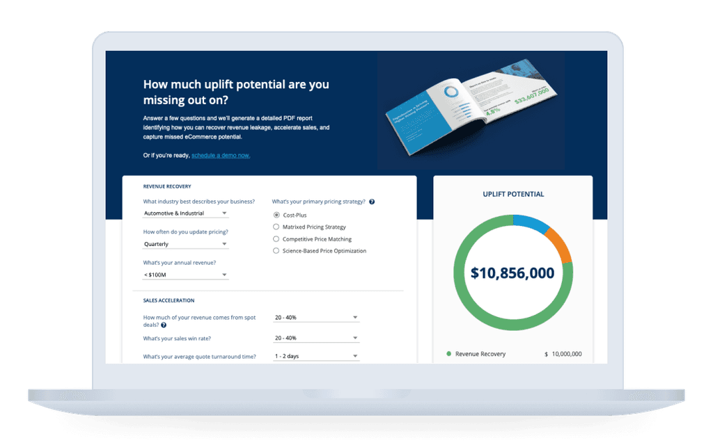
The PROS Revenue Uplift Calculator is a tool that for potential customers that provides them with a personalized, presentation-ready business case that estimates potential revenue uplift for their organization.
Role
Sole UI Designer
Timeline
December 2021 - April 2022
Tools
Sketch, Miro
Overview
In collaboration with Marketing, the UX team at PROS began an effort to find ways to increase customer lead generation on the PROS website. Several pain points were identified in the process, the first being the Revenue Uplift Calculator.
On first glance, the calculator had some obvious issues. Before we could address those, though, we first wanted to determine if the calculator held enough value to remain in use.
A valuable tool, an awkward experience.
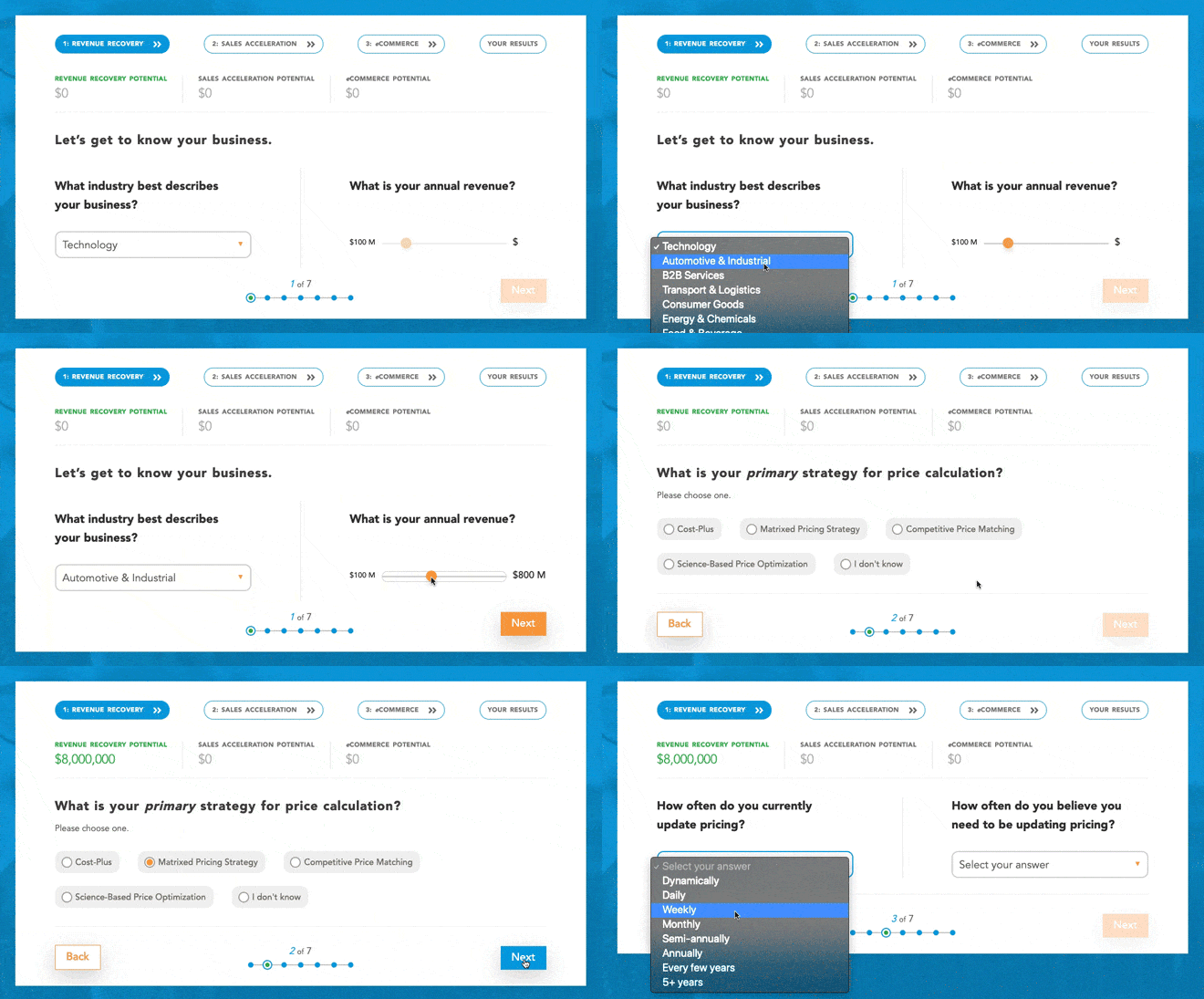
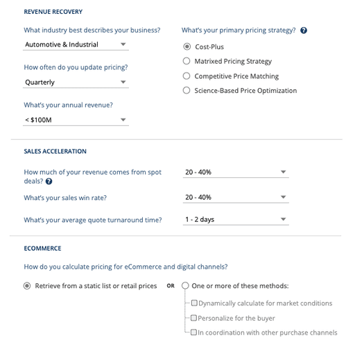
The Original Experience at a Glance
Research
Heuristic Evaluation & Usability Testing
In order to complete the heuristic evaluation, we carefully analyzed the UI using a set of 10 usability principles.
We also completed a moderated task-based usability test session with 5 participants, each voicing their process and thoughts aloud as they navigated through the form. With the results, we were able to nail down key insights in the calculator's experience.
The Positives
Users thought there was a strong business case for the tool.
Users thought the PDF output was sleek and professional.
The Negatives
Users typically would not have all of the necessary info required to complete the form, so completion times are often much longer than 5 minutes
Users thought the progress bar as the number of steps in each section, immediately perceiving the form as lengthy
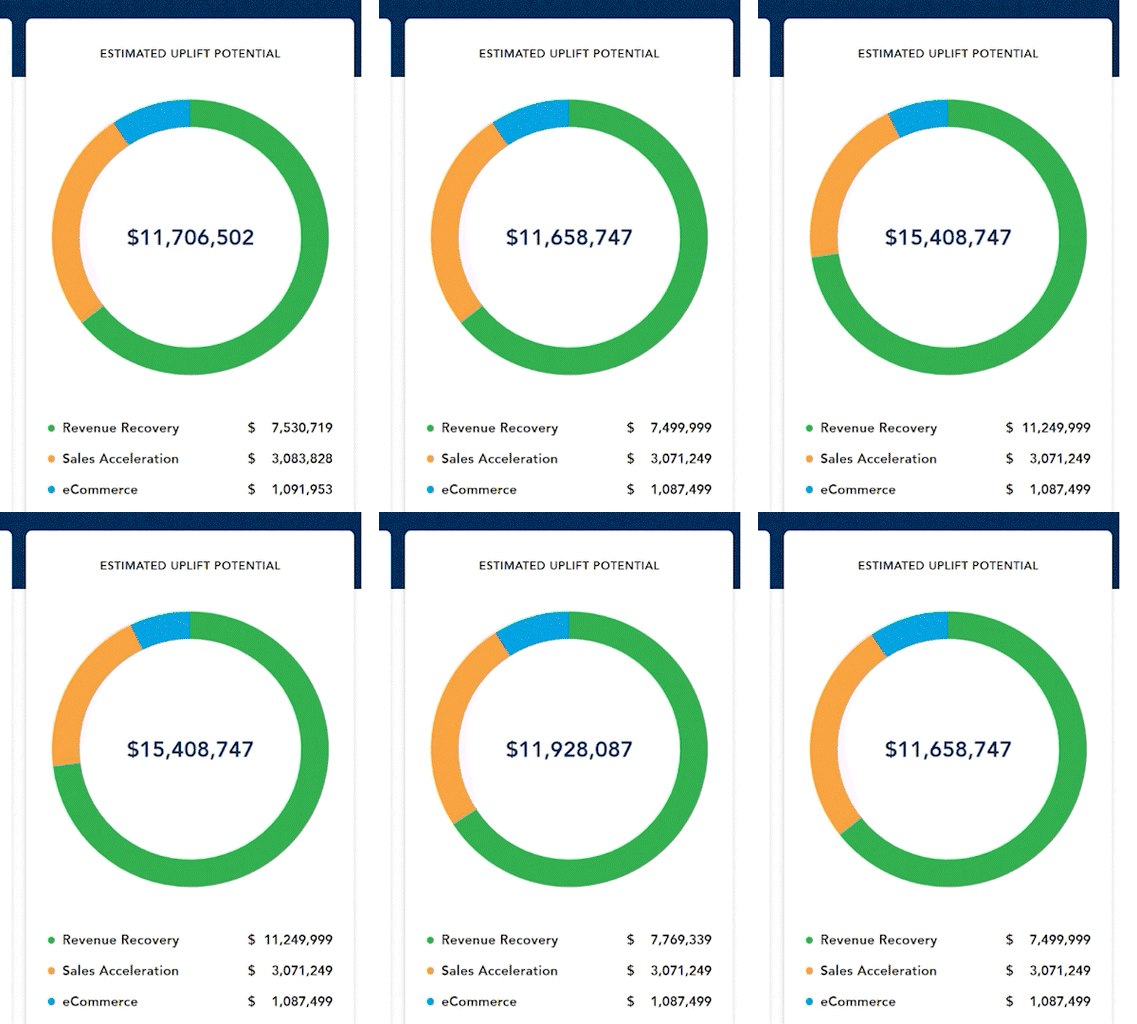
Broken UI elements made the form seem untrustworthy.
Competitive Analysis
With these issues in mind, we continued on to do a competitive analysis with a similar tool on Vendavo, a PROS competitor. We compared the strengths and differences between the two to further identify areas in which we could improve.
Vendavo's tool benefited from it's one-page layout, detailed explanations of industry terms, and was overall more inclusive of various industries. However, we found that PROS still won out in it's ability to output an impressively detailed report.
Establishing Goals
Now that we were aware of the tool as being something of value, both in generating leads and on the customer side, we worked on identifying ways we could improve the overall experience and prevent drop off throughout the form. Our goals ultimately fell into one of three categories.
Shorten the Experience
Improve Usability
Add Interactivity
Ideation & Design
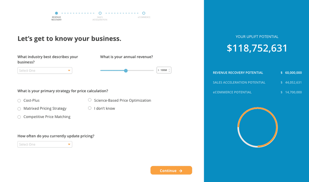
The First Iteration
Shorten the experience
Decreased the number of screens to 3 by moving all questions per section to one page.
Improve Usability
An input box on the slider allows for faster entry of precise numbers.
Add Interactivity
An interactive chart that changes values with each input helps to give users a better idea of their uplift breakdown.
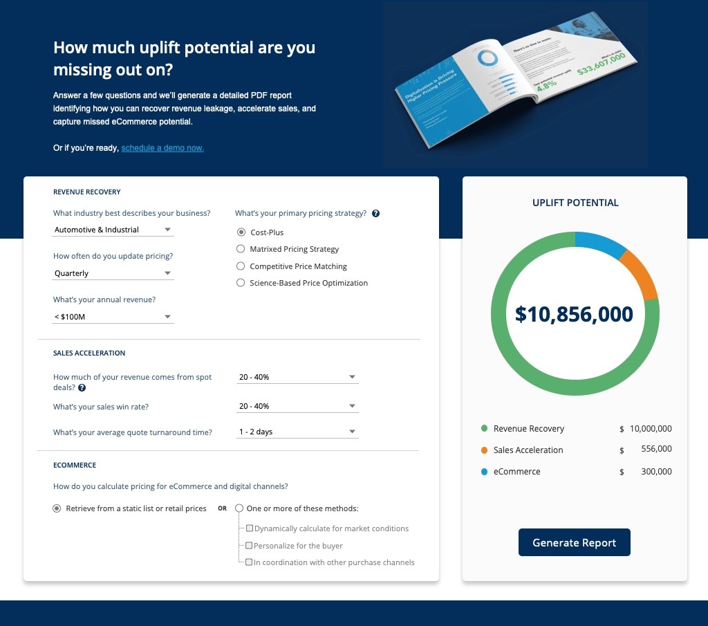
The Final Iteration
A Single-Page Layout
Users can see what's expected of them at a quick glance, and are much less likely to perceive the process as too lengthy.
Limiting Specificity
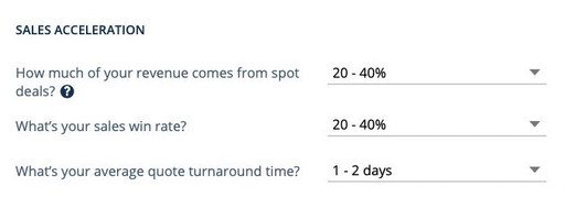
Replaced the original slider functionality with ranges, so users can spend less time worrying about getting specific.
Enhanced Copywriting
Adding transparency and imagery to promote what users will to receive after completing the form
Instant Feedback
Replaced the original slider functionality with ranges, so users can spend less time worrying about getting specific.
Other Changes
Several additional changes to the UI were made to enhance the experience:
Added informational breakdowns under tooltips for certain industry-specific terms.
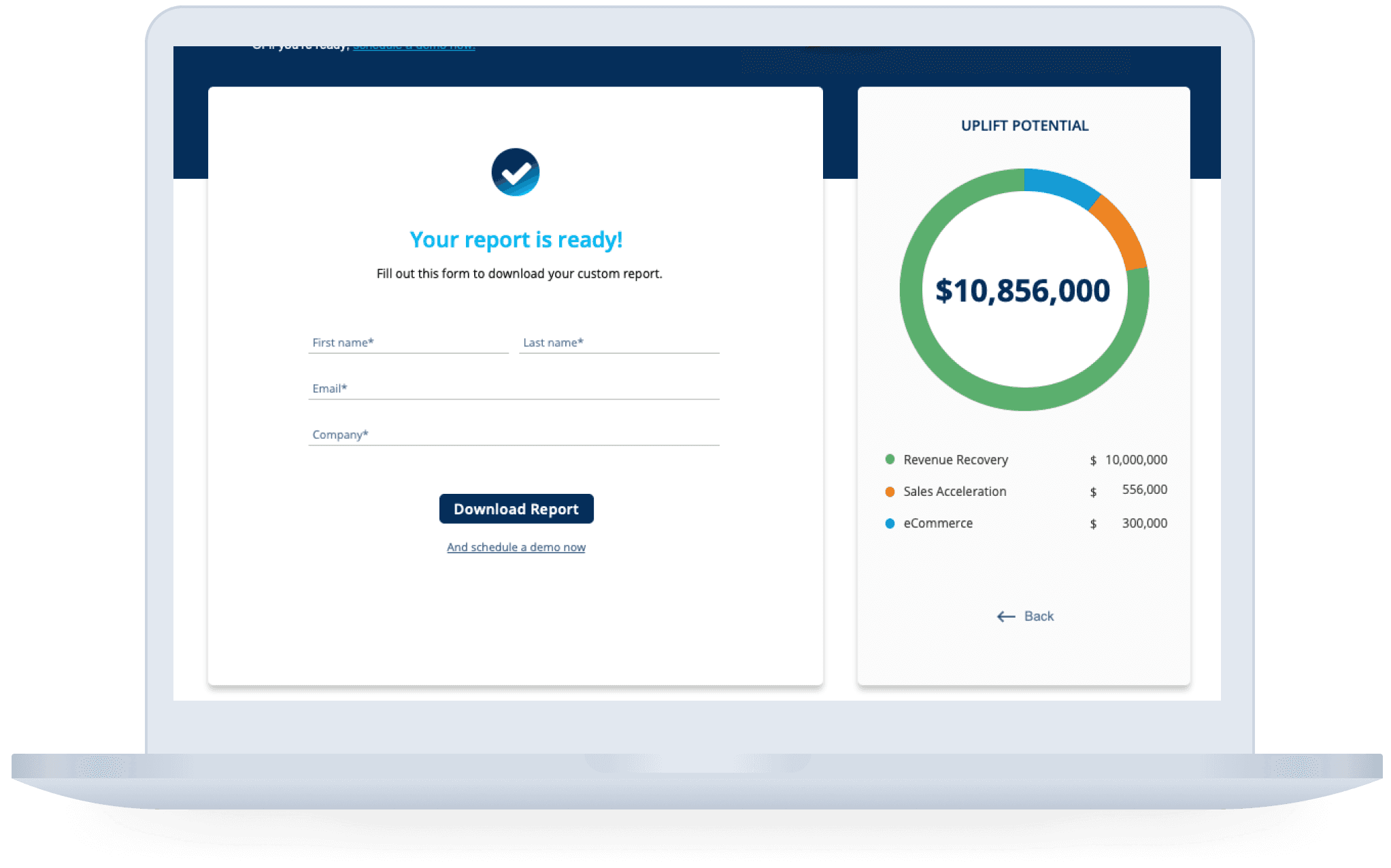
We felt that having required fields such as "phone number" were too personal and would make users wary. We removed these fields to shorten the contact form and prevent drop off at the last step.
Users are able to go back after generating the report to adjust any fields, an option that was missing in the original tool.
